SKILLS NEEDED
Blender/Figma/Adobe Creative Cloud
CATEGORIES
Graphic Design, Web Design, Branding, UI / UX
COPYRIGHT
Personal Project
What’s in a can?
In this case, decidedly no alcohol.
Inspired by Athletic Brewing Company‘s recent graphic designer job posting, I created ‘From the Depths,’ a conceptual can design for a non-alcoholic imperial IPA. This project allowed me to apply my graphic design skills to the craft beverage industry, even without prior beer can packaging experience.
The Challenge
Typically – beer can imagery thrives in its product shots. It needs to look cold and refreshing. There needs to be a sense of allure – something that sparks curiosity from the potential buyer. Something that makes them want to pick it up at the nearest store – or in this case – purchase it online
The Design
To visually represent the rich, complex flavors of ‘From the Depths,’ I opted for a dark blue background, symbolizing the ocean’s depths. The dynamic, yellow-ish red tentacles, rising from below, were chosen to add a touch of the unexpected, reflecting the boldness of the imperial IPA.
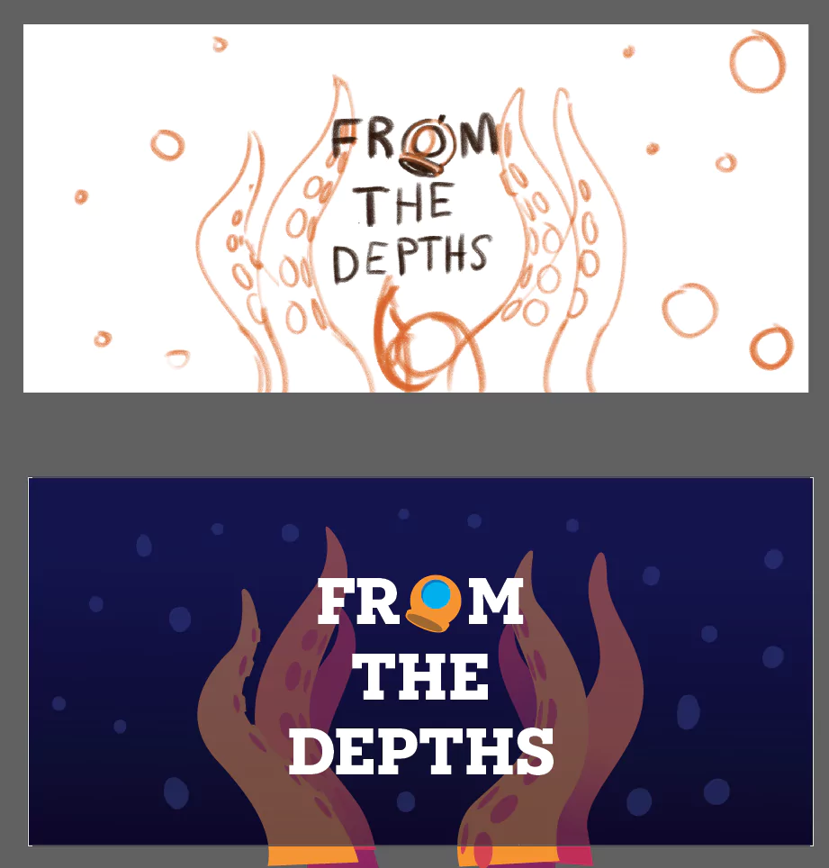
The diver’s helmet ‘O’ in ‘From’ was a deliberate design choice, adding a narrative element and reinforcing the name’s thematic connection.
In the image below, you can see my initial sketch in Photoshop, and the cleaned up graphic illustration in Illustrator. I took queues from Athletic’s overall design here. Clean gradients, and simplified shapes.

It doesn’t just stop there though.
If it did – it wouldn’t serve the purpose of delivering on the graphic’s intended purpose.
Designs like this should elicit a response from the viewer.
To showcase the design’s impact, I utilized Blender, and with some adjustments (UV mapping can be a finicky task), I put my design on a can.
The Online Storefront
The can renders are cool – and they are meant to be. They are what will entice the potential consumer to find out more about the product.
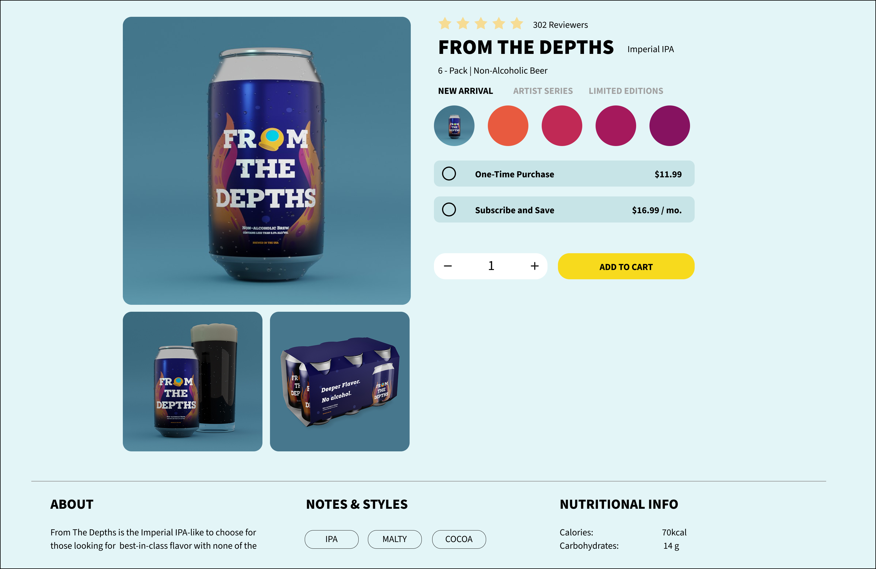
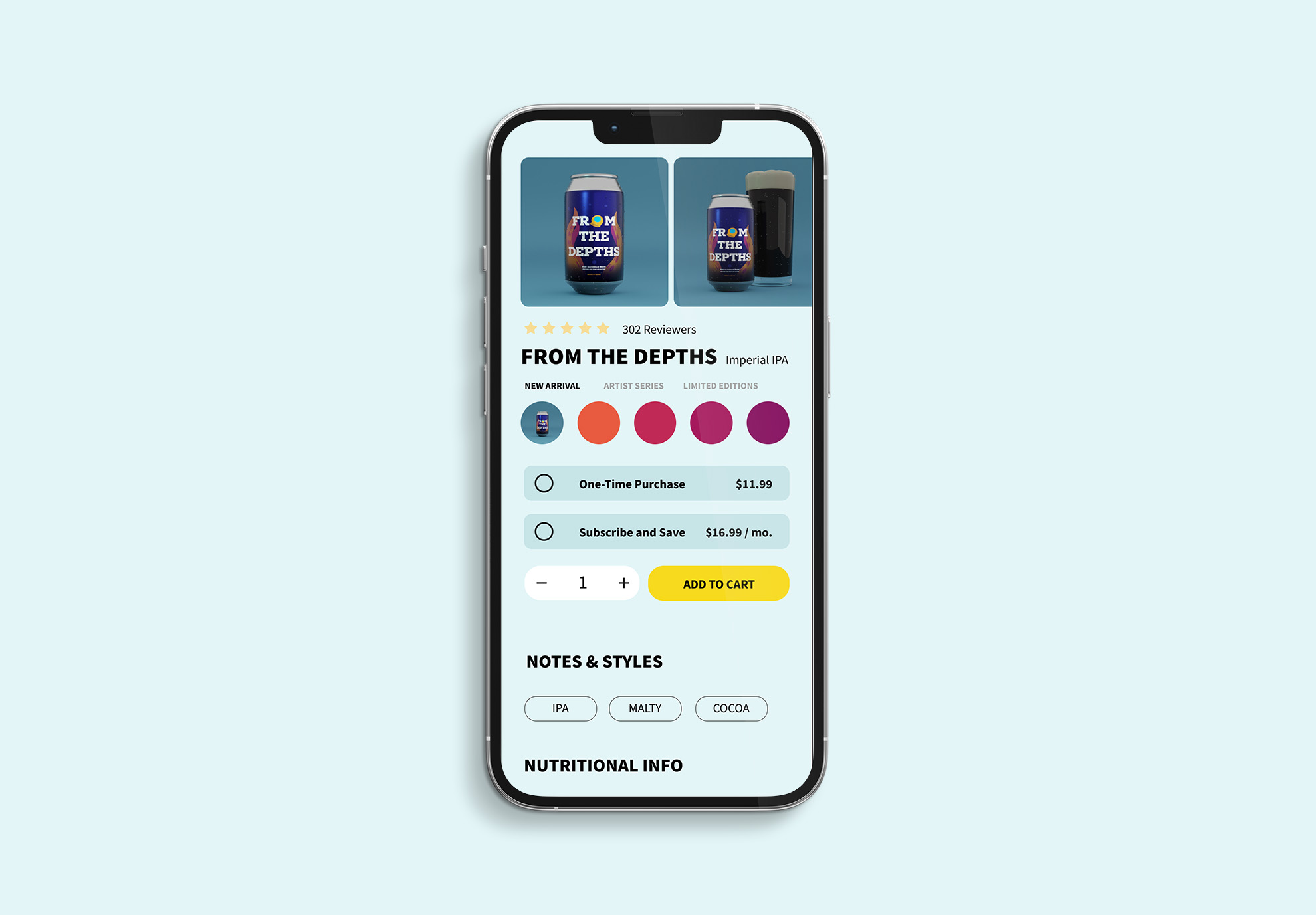
Here is where the online portion of this comes into play. I headed over to Figma to mock up the storefront. Again, since I am modeling this off of Athletic (Athletic, if you see this, let’s talk) I took some queues from their overall page design and mocked up a simple, clean, and colorful screen.
I also rendered out some simpler product shots, as anything really evocative would overwhelm the senses. On this page, the first read will be the can art, and the second read will be the ‘Add to Cart’ button.
Conclusion & next steps
This was a fun, informative project. Figma is a fun tool to use, and I cherish the moments I can go into a 3d modeling / rendering program. I might do a few more can design ideas, and research how to get the condensation to sweat on the cans more realistically in the product renders.
If I were to imagine a true-to-life design pipeline, I would come up with some killer ad copy, something that would really strike curiosity into the minds of the buyer. I would render out a few more glamour shots (maybe one with a real tentacle reaching out) and then plan a product video of the newest addition, featuring the market demographic for this can.
Meanwhile, social media posts would be planned to drop alongside the video, with a clear call to action, pointing to the shopping page.
And as for doing another can? I was thinking of a light session IPA called “Little Bit’ o Magic”. Maybe I’ll do that next.
Want to collaborate?
Tell me more about your project
Ready to transform your design vision into reality? I love solving visual problems. Whether you’re looking to revamp your brand, develop a standout digital experience, or craft compelling visual communication, let’s connect. Drop me a line or fill out the contact form below, and we’ll start turning your ideas into impactful design solutions.


